What are the examples of findability in developer portals?
There is rarely a “one shoe fits all” solution. Information architecture can vary from customer to customer in terms of the complexity of the products being offered to the simplicity of APIs that stand out from each other.
Setting up a developer portal is not just about sharing a bucket of building blocks. All the blocks have to be available, accessible, findable and discoverable. Companies that do this well give the developer portal users a structure: there are examples, the documentation is there where it is expected, troubleshooting is easy. In short: the overall experience is organised and in place.
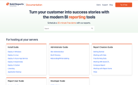
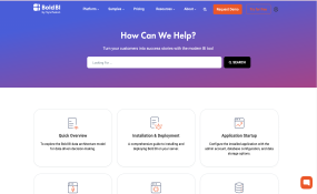
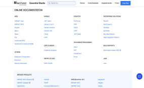
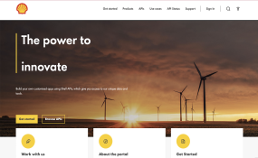
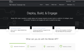
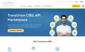
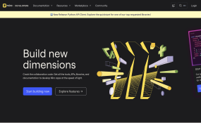
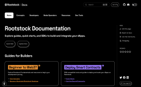
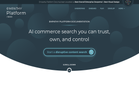
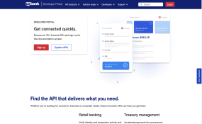
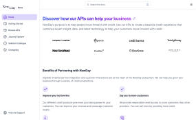
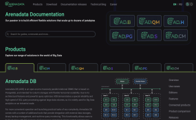
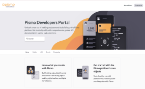
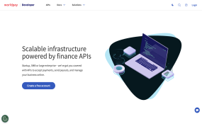
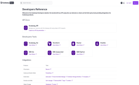
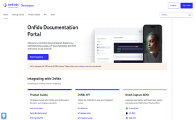
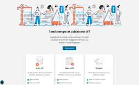
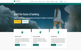
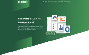
A landing page with entry points for the main audiences, a catalog, a basic search, a faceted search, and suggestive discoverability are all examples of ways in which an API consumer can find your APIs.
Read more about the anti-patterns of developer portals such as the API Freezer (being an obstacle for good findability and discoverability) on the Pronovix blog.
Award Criteria
Questions to ask:
-
Are there filtering options or is there relevant categorization and an easy entry point to the service catalog?
-
Is the experience visually appealing and easy to follow?
-
Are you reducing the friction to your user's journey to finding what they are looking for?
-
How discoverable are the products in your devportal?
-
How do you get people to know about an API for the first time?
-
How do you organize your catalog to allow for better discoverability?
As this award focuses on the findability of products, nominees for this category usually have more than a few API product offerings.
Over the past years, countless API teams have been hard at work, creating exceptional developer portals that empower and inspire us all. Interested in who excelled in this category?
